Colors
Color Palettes
The Whirlpool corporate palette represents our history and expertise, the diversity of our people, and our leading edge products and services. Color is used to bring approachability and flexibility to the visual identity system as building blocks for compositions. Color enhances design and meaning, but is used as an accent rather than the main element. Avoid color overload, it dilutes focus.
Use these colors exclusively for all corporate communications. It is essential that color remain consistent across all applications without adding additional palettes or hues. Color palettes cannot be mixed.
NEUTRAL COLORS
The use of limited color enables us to provide versatility and clarity to visually communicate with our employees. Designs should be mainly comprised of a neutral or white background, using color with sufficient contrast for accessibility to create focus.
Neutrals are essential to our corporate style to communicate but not compete with the core corporate colors. Neutrals should be used as the primary choice for text.


CORE AND CORRESPONDING ACCENT COLORS
Accomplished Blue is the core corporate color, supported by its corresponding accent color. Additional core colors include Conscientious Green, Universal Yellow, and Empathetic Orange. Each of these colors must be used alone, never together, as purposeful reinforcement to the Whirlpool function, event or purpose. If additional colors are needed, each color has a corresponding accent color to help balance your project.
Blue is the color of confidence and familiarity, representing heritage and the trust that our consumers have placed in us for over 110 years.
This jewel-toned blue is the core corporate color and used for corporate awards, government relations, investor relations, Board of Directors and Executive Committee, financial news, technology and company achievements.
Its corresponding accent color may be used sparingly and only with the core blue color.




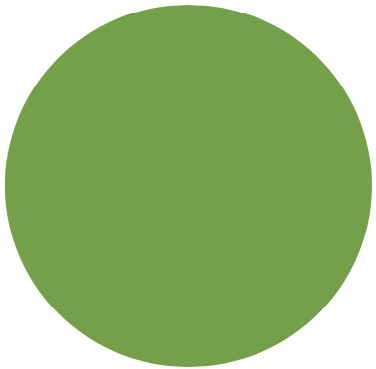
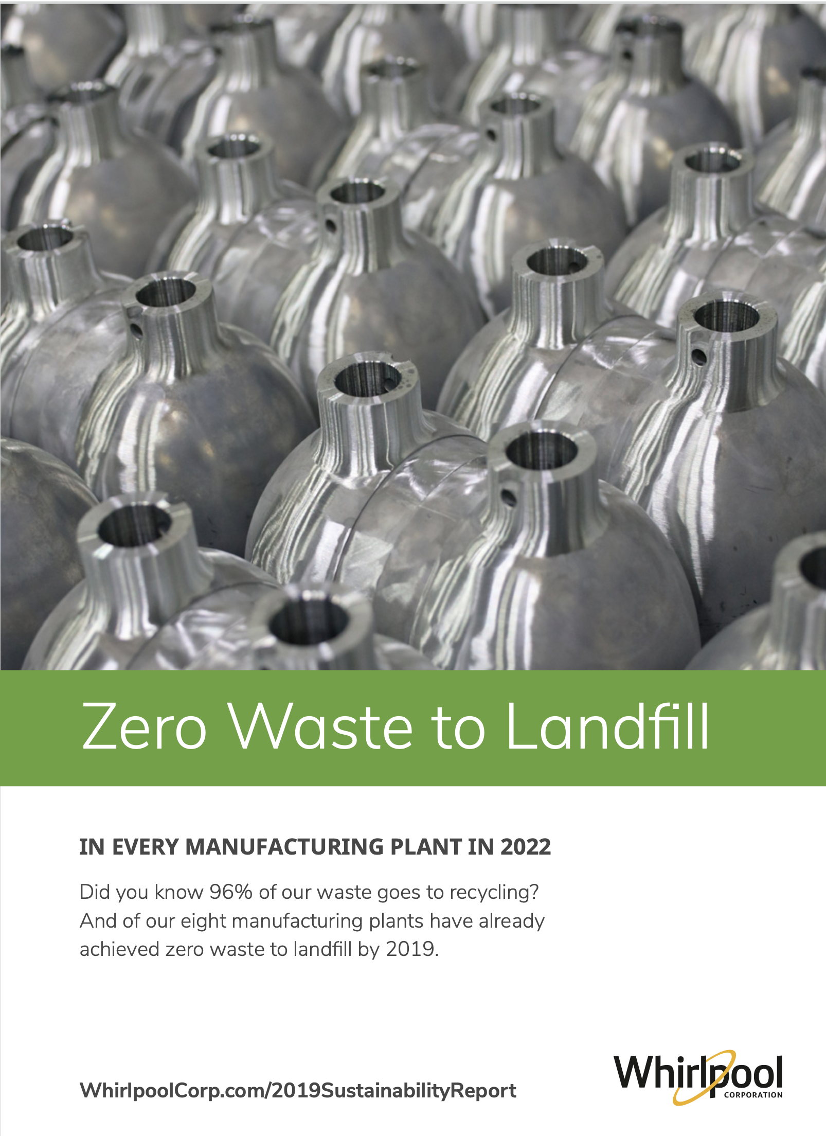
Green exemplifies growth and vitality, representing the commitment we have to our environment to improve lives throughout communities around the world.
Green is best used to feature sustainability, social responsibility initiatives and volunteering. These instances can also default to core blue, but the green palette should use the neutrals as primary, not mix with blue.
Its corresponding accent color may be used sparingly and only with the core green color.



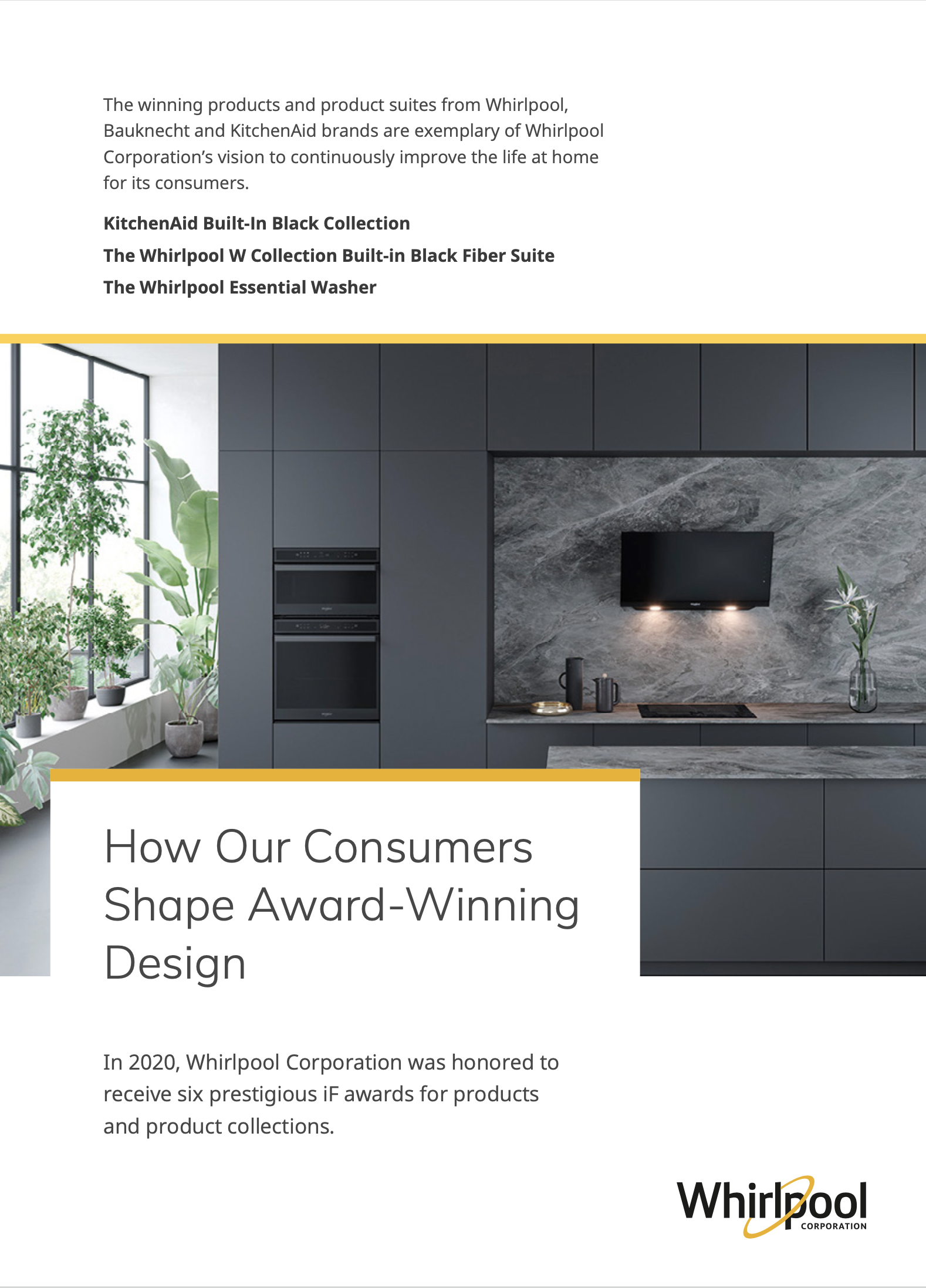
Yellow reflects our vibrancy, fresh energy and optimism, indicative of clear thinking and confident decision-making.
It is recommended to use yellow to highlight insights and home style trends, design, collaborative research with schools and businesses and our products. These instances can also default to core blue, but the yellow palette should use the neutrals as primary, not mix with blue.
Its corresponding accent color may be used sparingly and only with the core yellow color.




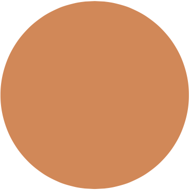
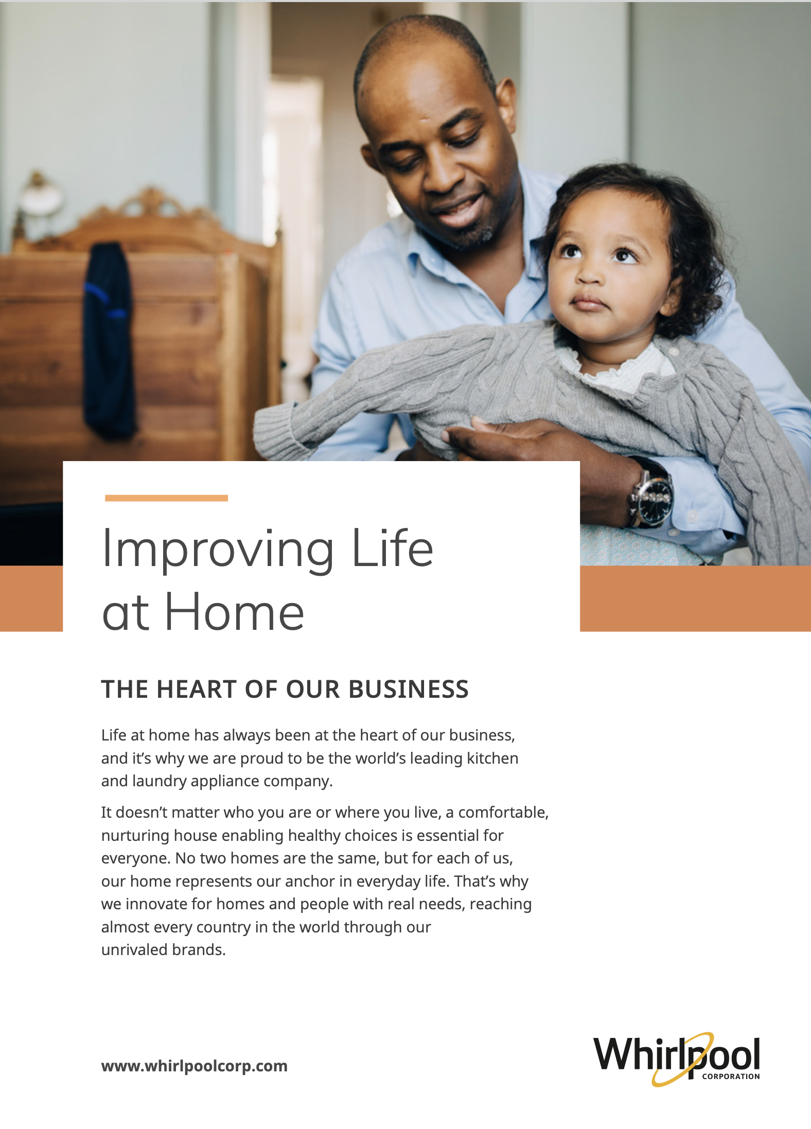
Orange delivers positivity, enthusiasm and determination. It represents an essential element of our company: our people.
Best used for employee achievements, engagement activities, career development activities, people development and Inclusion & Diversity. These instances can also default to core blue, but the orange palette should use the neutrals as primary, not mix with blue.
Its corresponding accent color may be used sparingly and only with the core orange color.

Color Proportions
Build from white as a foundation, and the eye will focus on the message. White should occupy the most space on a page. Color is an accent, imparts Whirlpool Corporation’s cultural tone, reinforces the messaging and is always purposeful.
1
Start with a White Background

2
Choose 1 Core Color
(with its accent)

3
Complete Your Project's Color Palette with Neutrals

Color Guidance
Color Guidance
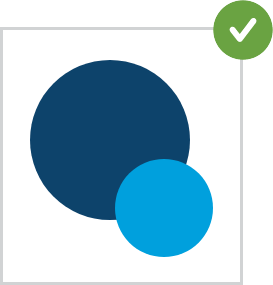
DO use only one color at a time with its corresponding accent hue and neutrals.
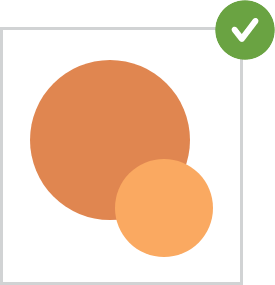
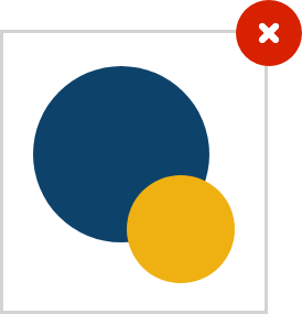
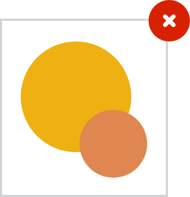
DO NOT use our Core Yellow, Orange or Green colors as a headline. They fail to meet compliancy standards for sufficient color contrast.






Function/Category Palette in Context

BLUE
- Corporate awards
- Government relations
- Investor relations
- Board of Directors and EC
- Financial news
- Technology
- Company achievements
GREEN
- Sustainability
- Social responsibility
- Volunteering
YELLOW
- Insights
- Home trends
- Design
- Collaborativve research
- Products
ORANGE
- People-centric
- Employee achievements
- Engagement
- Career development
- People development
- Inclusion & diversity


